Create Your First Project
Start adding your projects to your portfolio. Click on "Manage Projects" to get started
Cloud hotel brand kit
Project Type
Branding, Visual identity, advertisement (case study)
Date
2026
Welcome to Cloud Hotel & Spa, a serene retreat set in the heart of the Norwegian countryside—where tranquility replaces the bustle of city life.
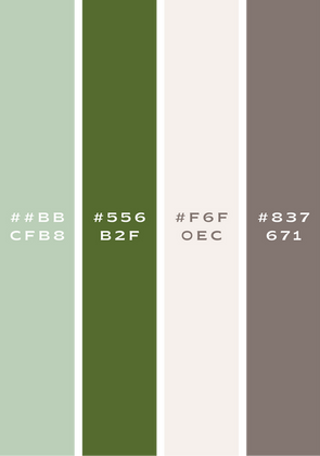
Inspired by Nordic landscapes and principles of quiet luxury, the brand’s visual language is defined by soft greens and warm, muted neutrals. These tones are carefully selected to evoke calm, balance, and restoration, creating a sense of natural elegance. The identity feels refined and deeply connected to an organic way of living.
Cloud Hotel’s logo embraces quiet luxury through sculptural typography and a calm, grounded color palette. The stacked letterforms create a composed, architectural presence, while the muted green evokes nature, balance, and restoration.
In the advertisement, the circular architectural form frames the imagery and acts as a visual focal point, symbolizing rest, continuity, and shelter. Elegant serif typography contrasts gently with the organic elements, creating a composed and refined expression that reflects Cloud Hotel’s serene and restorative identity.
The business card features a soft, warm off-white background that introduces lightness and calm to the identity. Subtle, repeating wave-inspired patterns add depth and organic texture without overpowering the typography. Paired with the muted green wordmark, the background enhances legibility while reinforcing a sense of balance and craftsmanship.


